


| GRAPHICS & ART |
USE THE BACK ARROW AFTER CLICKING ON THESE LINKS
| All content on this website was generated by Allan L. Flowers and is subject to usage restrictions. It is provided here for educational and informational use only. Limited use of some materials, with proper attribution, etc, may be possible. Contact: allanflowers@yahoo.com |


TOP DAWG
This fun project was for a poster and T-shirt to promote a "fly-in" at my local RC flying club. The idea of a "top dog" was fun to work with. Since we are
called the PALOMAR FLYERS, near Palomar Mountain and the famous Palomar Observatory, I wanted to try something with the dog mistaking the
observatory for a fire hydrant. That is the first design on the left. The middle one was a more mundane idea with the dog chasing a car. The one on the
right was the final version (politically correct!), ALSO with a rather less aggressive dog face too... It was fun doing this work for the club.
| Most of the so-called graphic design I have done is for posters or things like that. I have seen some incredible graphic design work and have no illusion than I am even remotely at that level. |


This is part of the work done to promote my model airplane kits.
A logo for a CALENDAR project.
A LOGO project for some treasured old friends with great products and company.


More graphic work for the model kits. In the case of the left two images, they were used to print paper for
fuselage covering, in accurate colors/patterns. It is purposefully blurred and yellowed to be more
convincing when installed on the models. The pix on the right is for placement on seats, wheels, etc.
fuselage covering, in accurate colors/patterns. It is purposefully blurred and yellowed to be more
convincing when installed on the models. The pix on the right is for placement on seats, wheels, etc.


POSTERS for
NDL@AAU
NDL@AAU
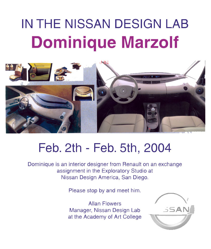
A major responsibility in running the Nissan Design Lab at the
Academy of Art University included bringing designers from our
studios (primarily NDA in San Diego) to San Francisco. This served a
dual purpose: exposing the AAU students to real production and
advanced car designers - and promoting growth for the young staff.
Academy of Art University included bringing designers from our
studios (primarily NDA in San Diego) to San Francisco. This served a
dual purpose: exposing the AAU students to real production and
advanced car designers - and promoting growth for the young staff.
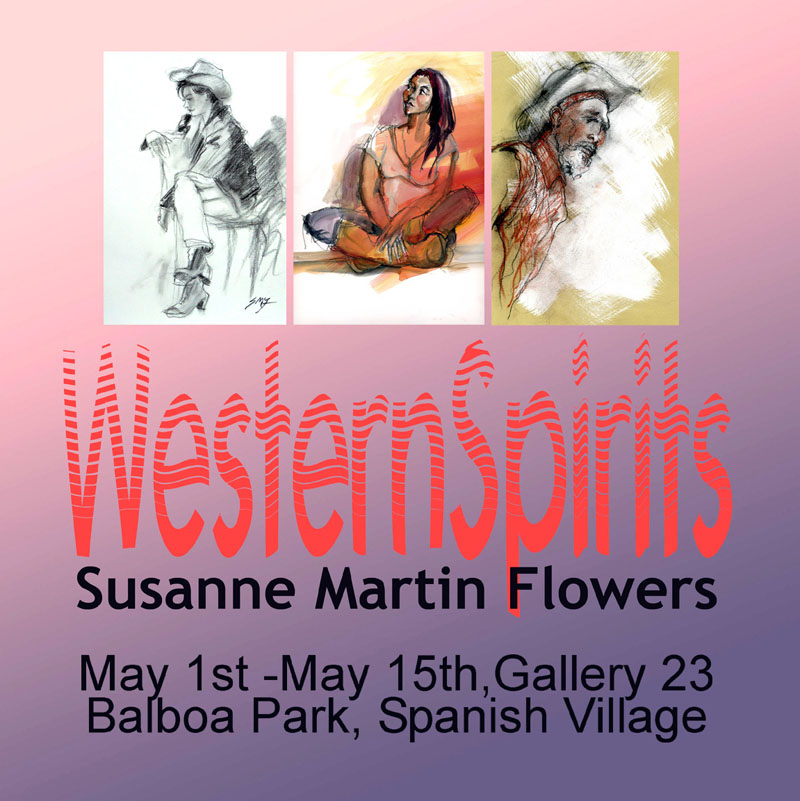
These are posters and
mailers for art projects.
It has been interesting
and fun to promote
these talented people
and their events.
mailers for art projects.
It has been interesting
and fun to promote
these talented people
and their events.


This particular
"poster" was
designed to
gently push AAU
to improve the
entry situation at
the ID
Department.
"poster" was
designed to
gently push AAU
to improve the
entry situation at
the ID
Department.
A few more graphic projects
Jerry Hirshberg got us a job doing a redesign of the LA Times. They were very enthusiastic although we always suspected that they would
never go with anything too different from the traditional newspaper look. The downside of changing a newspaper was huge – subscribers would
drop off in mass if their comfortable layouts were changed, even minutely.
Still, this was an exciting and creative project since they really wanted to see what we could come up with.
Among the ideas were these interesting graphic schemes (below). The “mast head” was modernized and made into a graphic layout idea (the “L”
shape). Sections were color coded with bands of color running across the FOLD, enabling the reader to immediately find the section desired. Run-
over articles (a constant complaint) were at least color coded to help the reader find the continuation. The organizational ‘helps’ on the upper left
corners were enhanced and expanded. Even things like emphasizing the fact that the LA Times used recycled newsprint was a plus, since readers
had often complained about the ‘stink’ of the paper, not realizing that it was recycled. For this they should thank Brenda Parkin, who did a ‘smell
study’ of various newspapers (people actually wanted a paper that smelled like coffee - or maybe donuts?).
Several things became clear during this project. Our lowly San Diego Union-Tribune, (although regarded with total liberal contempt) was actually
decades ahead of the LA Times in terms of graphic design. Secondly, I began to understand how the editing of a few other major papers, notably
the NY Times, is completely lacking. No one there seems willing to cut the fat on their bloated run-on articles.


Car Styling Magazine (Japan) was kind enough to do this story. I had had some (limited) success (critically) but soon decided that the art
world is crazy and not for me. So I went into designing model airplanes (consider them kinetic sculptures).
world is crazy and not for me. So I went into designing model airplanes (consider them kinetic sculptures).


After Renault acquired Nissan, we participated in a redesign of the LOGO. In the
final version (done in Japan) the changes were relatively small. These were done
earlier when we thought they might want a bigger difference. By this point in my
career my primary design & rendering tool was ALIAS/WAVEFRONT.
final version (done in Japan) the changes were relatively small. These were done
earlier when we thought they might want a bigger difference. By this point in my
career my primary design & rendering tool was ALIAS/WAVEFRONT.